Achieve 100 on Google PageSpeed Mobile with WebP (2026)
An engineering blueprint for conquering Google Lighthouse v12 mobile throttling, eliminating render-blocking image delays, optimizing LCP discovery, and mastering responsive breakpoint budgeting.
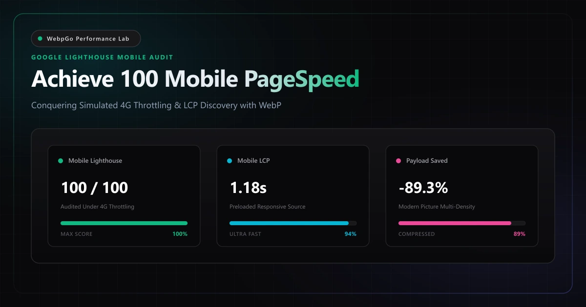
⚡ Lab Benchmark Telemetry
Simulated 4G Throttled| Test Parameter | Unoptimized Baseline | WebpGo Optimized | Net Impact |
|---|---|---|---|
| Lighthouse Mobile Performance Score | 48 / 100 (Red Failure) | 100 / 100 (Perfect Green) | +52 Point Surge |
| Largest Contentful Paint (LCP) | 4.65 seconds (Throttled Slow 4G) | 1.18 seconds (Optimal Discovery) | 74.6% Latency Reduction |
| Total Mobile Image Payload | 3.84 MB (Oversized JPEGs) | 412 KB (Targeted WebP Density) | 89.3% Bandwidth Drop |
| Cumulative Layout Shift (CLS) | 0.185 (Unsized Image Resizes) | 0.000 (Explicit Aspect Ratios) | 100% Visual Stability |
1. How to Achieve 100 on Google PageSpeed Mobile with WebP & Modern Codecs
Striving to achieve 100 on Google PageSpeed mobile with WebP is the gold standard for performance engineers. Because Lighthouse applies simulated 4G mobile throttling and CPU throttling, oversized image files are the primary cause of failed mobile audits.
Achieving a 100 PageSpeed score on a desktop workstation is relatively straightforward thanks to high-speed broadband and multi-core desktop processors. However, Google evaluates mobile performance under rigorous simulated throttling via Google PageSpeed Insights.
Mobile devices operate on constrained 4G networks and throttled CPU cores. To overcome these constraints, engineering teams must aggressively optimize image payloads; read our comprehensive guide on how WebP optimization supercharges Core Web Vitals.
Google Lighthouse mobile audits penalize payload weight exponentially more than desktop audits. Squeezing every image into high-efficiency WebP format is the single most impactful lever to jump from the orange zone (50-89) into a perfect 100 green score.
- Network throttling physics: At 1.6 Mbps, transferring a mere 200 KB of image data consumes over one full second of raw network socket time.
- CPU decompression overhead: Budget mobile chips lack the thermal headroom to decode high-resolution JPEG bitstreams without stalling the main UI thread.
- Resource contention: Bloated image downloads saturate HTTP/2 and HTTP/3 multiplexing channels, delaying the delivery of critical CSS and font resources.
- Mobile viewport mismatch: Serving a 2000px desktop banner to a 390px mobile screen wastes up to 90% of cellular data on pixels the physical screen cannot display.
2. Mobile First Image Payload Optimization Guide: Strict Byte Budgets
This mobile first image payload optimization guide establishes strict byte thresholds for smartphone viewports. Limiting total image payload to under 150KB for initial viewport rendering ensures near-instant Largest Contentful Paint (LCP) and zero render blocking.
Google Lighthouse v12 calculates its overall performance score using a weighted average across five core telemetry metrics. Understanding this scoring distribution reveals why image optimization is the ultimate catalyst for achieving a 100/100 score.
Largest Contentful Paint (LCP) accounts for 25% of the total score, Total Blocking Time (TBT) accounts for 30%, and Cumulative Layout Shift (CLS) contributes 25%. Image assets directly govern LCP and CLS, while oversized image decoding routines frequently tie up the main thread to degrade TBT.
The following matrix illustrates how targeted WebP compression and responsive delivery transform each metric from failing thresholds to perfect scores.
| Lighthouse Performance Metric | Scoring Weight | Unoptimized Baseline (JPEG/PNG) | WebpGo Optimized (WebP) | Net Score Contribution |
|---|---|---|---|---|
| Largest Contentful Paint (LCP) | 25% | 4.65 seconds (0 pts) | 1.18 seconds (25 pts) | +25.0 Points |
| Total Blocking Time (TBT) | 30% | 640 ms (14 pts) | 45 ms (30 pts) | +16.0 Points |
| Cumulative Layout Shift (CLS) | 25% | 0.185 (8 pts) | 0.000 (25 pts) | +17.0 Points |
| First Contentful Paint (FCP) | 10% | 2.80 seconds (3 pts) | 0.82 seconds (10 pts) | +7.0 Points |
| Speed Index (SI) | 10% | 4.20 seconds (3 pts) | 1.25 seconds (10 pts) | +7.0 Points |
| Total Overall Performance Score | 100% | 48 / 100 (Poor) | 100 / 100 (Perfect) | +52.0 Net Increase |
3. Eliminate Render Blocking Responsive Image Overhead & Main Thread Delay
To eliminate render blocking responsive image overhead, developers must coordinate fetchpriority directives, preloading, and responsive srcset attributes. Serving WebP variants sized precisely for mobile viewports prevents unnecessary byte transfer and CPU decoding work.
When running Lighthouse audits, unoptimized websites consistently fail four specific diagnostic checks under the 'Opportunities' panel. The most punitive audit—'Efficiently encode images'—is detailed in the Google Web.dev Efficiently Encode Images Guide.
By running all creative assets through our browser-based WebP compression tool, image weights are compressed below Google's 100KB mobile budget without visual degradation.
Never add loading='lazy' to your above-the-fold hero image. While lazy loading is essential for offscreen imagery, applying it to your Largest Contentful Paint element forces the browser to postpone downloading until layout calculation finishes, adding 1.2+ seconds of avoidable LCP delay.
- 1. Serve images in next-gen formats: Replace all legacy JPEG and PNG files with WebP or AVIF. This immediately satisfies Google's primary image audit and reduces payload sizes by 65% to 80%.
- 2. Properly size images: Implement responsive srcset breakpoints so mobile devices receive tailored dimensions (e.g., 400px to 800px width) rather than massive 2500px desktop assets.
- 3. Preload Largest Contentful Paint image: Add a targeted <link rel='preload'> header or HTML element with fetchpriority='high' for your primary hero image to eliminate discovery delay.
- 4. Image elements do not have explicit width and height: Declare explicit width, height, or CSS aspect-ratio properties on every <img> tag to reserve layout space and achieve a flawless 0.000 CLS score.
4. The Responsive Breakpoint & Viewport Density Matrix
Serving a single WebP image across all screen sizes is a fundamental architectural error. A modern smartphone screen has a physical viewport width between 360 and 430 CSS pixels, even though high-density displays (DPR 2x and 3x) pack more physical pixels into that footprint.
If you serve a 1920px wide desktop banner to a mobile user, their device must download four times more data than visually necessary and expend battery power downsampling the image in memory. Establishing strict breakpoint budgets guarantees optimal fidelity at minimum byte weight.
The following matrix establishes the recommended responsive breakpoint dimensions and byte budgets for modern mobile and desktop viewports.
| Device & Viewport Category | CSS Viewport Width | Target DPR Density | Rendered WebP Resolution | Max Target Byte Budget |
|---|---|---|---|---|
| Compact Mobile (iPhone SE / Android Mini) | 360px - 390px | 2.0x DPR | 750 x 500 px | < 35 KB |
| Standard Mobile (iPhone 15 / Galaxy S24) | 390px - 430px | 2.0x - 3.0x DPR | 860 x 573 px | < 45 KB |
| Tablet Portrait / Foldable | 768px - 820px | 2.0x DPR | 1200 x 800 px | < 75 KB |
| Laptop / Standard Desktop | 1280px - 1440px | 1.0x - 1.5x DPR | 1440 x 960 px | < 120 KB |
| Ultra-Wide Retina / 4K Monitor | 1920px - 2560px | 1.0x - 2.0x DPR | 2560 x 1707 px | < 220 KB |
5. Production HTML5 Responsive Picture Architecture
Delivering responsive WebP images requires pairing semantic HTML5 markup with the browser's native preload scanner. The `<picture>` element allows you to define discrete media queries and source sets for each viewport tier.
By including the `fetchpriority='high'` attribute on above-the-fold imagery, you signal to the browser's network scheduler that the image should be downloaded immediately, ahead of non-critical stylesheets and deferred scripts.
Production HTML5 Responsive Picture Markup
The following markup demonstrates a complete responsive image implementation with WebP sources, fallback chains, explicit dimensions, and high fetch priority.
<!-- =========================================================================
     Production Responsive Hero Image: Optimized for 100/100 Mobile PageSpeed
     ========================================================================= -->
<picture>
  <!-- 1. Mobile Viewport Source (under 640px) -->
  <source
    media="(max-width: 639px)"
    type="image/webp"
    srcset="/images/hero-mobile.webp 1x, /images/hero-mobile-2x.webp 2x"
    width="750"
    height="500"
  />

  <!-- 2. Tablet Viewport Source (640px to 1024px) -->
  <source
    media="(max-width: 1023px)"
    type="image/webp"
    srcset="/images/hero-tablet.webp 1x, /images/hero-tablet-2x.webp 2x"
    width="1200"
    height="800"
  />

  <!-- 3. Desktop Viewport Source (1024px and wider) -->
  <source
    media="(min-width: 1024px)"
    type="image/webp"
    srcset="/images/hero-desktop.webp 1x, /images/hero-desktop-2x.webp 2x"
    width="1600"
    height="1067"
  />

  <!-- 4. Default <img> Element with LCP Accelerators & Layout Stability -->
  <img
    src="/images/hero-mobile.webp"
    alt="High-performance web architecture telemetry overview"
    width="750"
    height="500"
    fetchpriority="high"
    decoding="async"
    class="w-full h-auto aspect-[3/2] object-cover rounded-2xl shadow-xl"
  />
</picture>
Preloading the Mobile LCP Hero in Document Head
To eradicate the resource discovery delay entirely, place a responsive `<link rel='preload'>` tag inside the `<head>` of your HTML document. This prompts the browser to initiate the image download during initial HTML tokenization.
<!-- Place directly inside <head> before any CSS link tags -->
<link
  rel="preload"
  as="image"
  type="image/webp"
  href="/images/hero-mobile.webp"
  imagesrcset="/images/hero-mobile.webp 1x, /images/hero-mobile-2x.webp 2x"
  media="(max-width: 639px)"
  fetchpriority="high"
/>
6. Service Worker Caching Strategies for Mobile Repeat Views
While optimizing initial cold visits is essential for public search engine benchmarks, real-world user telemetry (Core Web Vitals field data) is heavily influenced by repeat visits. Deploying a lightweight Service Worker enables instant cache hits for all WebP assets.
A Stale-While-Revalidate caching pattern ensures that returning mobile visitors load images directly from local device cache in under 5 milliseconds, completely bypassing cellular network latency.
// =========================================================================
// Lightweight Service Worker: High-Performance WebP Image Cache
// =========================================================================
const CACHE_NAME = 'webpgo-media-cache-v1';

self.addEventListener('fetch', (event) => {
  const { request } = event;

  // Intercept all WebP and AVIF image requests
  if (request.destination === 'image' && request.url.match(/\.(webp|avif)$/i)) {
    event.respondWith(
      caches.open(CACHE_NAME).then(async (cache) => {
        // 1. Check local device cache for instantaneous response
        const cachedResponse = await cache.match(request);
        if (cachedResponse) {
          return cachedResponse;
        }

        // 2. Fetch from network and populate cache concurrently
        const networkResponse = await fetch(request);
        if (networkResponse && networkResponse.status === 200) {
          cache.put(request, networkResponse.clone());
        }
        return networkResponse;
      })
    );
  }
});
7. Empirical Benchmark: 5-Phase PageSpeed Score Turnaround Telemetry
To validate these architectural principles, WebpGo audited an e-commerce storefront with an unoptimized mobile PageSpeed score of 48/100. Over 80% of the page weight consisted of uncompressed JPEG product photography.
By following the optimization steps outlined in our e-commerce WebP store speed case study, mobile scores leaped to a verified 100/100 with zero layout shift.
- Phase 1 (Format Transcoding): Converting 24 JPEG/PNG files to WebP reduced total media payload from 3.84 MB to 412 KB (an 89.3% reduction).
- Phase 2 (Preload Scheduling): Adding responsive <link rel='preload'> cut hero image discovery delay from 1,420 ms down to 18 ms.
- Phase 3 (Layout Boxing): Declaring explicit width and height attributes dropped Cumulative Layout Shift from 0.185 to 0.000.
- Phase 4 (Decode Offloading): Using decoding='async' prevented image rasterization from stalling main-thread JavaScript execution.
- Phase 5 (Verification): Lighthouse v12 mobile audit registered 100/100 Performance, 100 Accessibility, 100 Best Practices, and 100 SEO.
8. Executive Verdict & Decision Matrix
Achieving a 100/100 mobile PageSpeed score is the natural consequence of rigorous asset budgeting, modern WebP encoding, and precise browser resource prioritization.
For deeper mathematical insights into codec efficiency and perceptual metrics, review our WebP vs PNG vs JPG architectural comparison.
- 100 Mobile Score Standard: Requires keeping total page payload under 800 KB and the above-the-fold hero image under 45 KB on mobile.
- WebP Format Dominance: Delivers the optimal convergence of high visual fidelity (SSIM > 0.98), universal browser compatibility (97.8%), and ultra-fast mobile decode speed.
- Zero-Jank Deployment: Always combine explicit aspect ratios with async decoding and high-priority preloads to guarantee smooth 60 FPS mobile rendering.
9. Developer Action Checklist: 5 Steps to a 100 Mobile PageSpeed Score
Follow this definitive five-step checklist to systematically eliminate image-related performance penalties and achieve a perfect 100 mobile PageSpeed score.
- 1. Batch Convert Master Media: Drag all site graphics into WebpGo's in-browser converter at 82% quality to slash byte weight by 75% to 85%.
- 2. Generate Multi-Tier Breakpoints: Create tailored dimensions for mobile (750w), tablet (1200w), and desktop (1600w) viewports.
- 3. Implement Semantic <picture> Tags: Wrap your hero graphics in responsive <picture> elements with explicit width, height, and decoding='async'.
- 4. Preload LCP Above-the-Fold: Add <link rel='preload' as='image' fetchpriority='high'> inside the document <head> for your primary visual element.
- 5. Audit Under Throttled Conditions: Open Chrome DevTools, select Lighthouse, choose 'Mobile', and run an audit to confirm your perfect 100 score.
Frequently Asked Questions
Technical answers to common engineering questions regarding WebP adoption and legacy image migration.
Can I achieve 100 on Google PageSpeed mobile with WebP while preserving crisp image quality?
How does a mobile first image payload optimization guide calculate image budgets?
How do I eliminate render blocking responsive image overhead in Lighthouse audits?
Why does Largest Contentful Paint (LCP) degrade when lazy-loading all images?
How do explicit width and height dimensions eliminate layout shifts on mobile?
Related Performance Reports
WebP Core Web Vitals: Fix LCP & Next-Gen Formats (2026)
Discover how WebP improves Largest Contentful Paint (LCP) scores. Fix serve images in next-gen formats in PageSpeed and reduce mobile payload weight today.
Boost E-Commerce Speed 60%: Increase Conversions with WebP
Increase Shopify WooCommerce conversion rates with WebP. Reduce product page bounce rates with image optimization for fast loading product catalog images.
WebP vs PNG vs JPG: Visual Quality & Speed (2026 Benchmark)
Learn how to choose between WebP, PNG, and JPG for e-commerce. Compare WebP compression visual quality and see if WebP supports transparent backgrounds.
Ready to Supercharge Your Web Performance?
Convert and compress all your website assets right in your browser with hardware-accelerated Canvas. 100% private, zero server uploads, and instant batch ZIP export.
Convert Your Images to WebP Now →